Design system for tutu.ru
This is an overview case describing what the design system consisted of, without unnecessary details.I will describe interesting parts in more detail later.
How it is organized in Figma
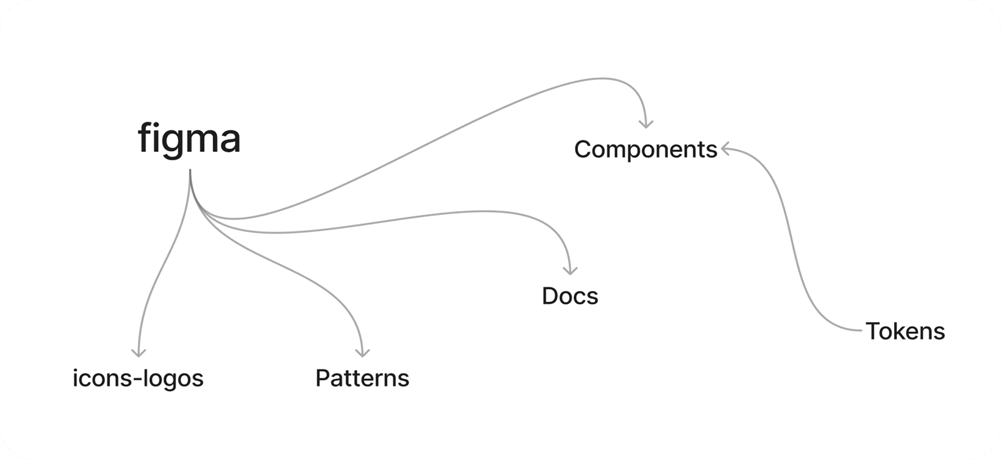
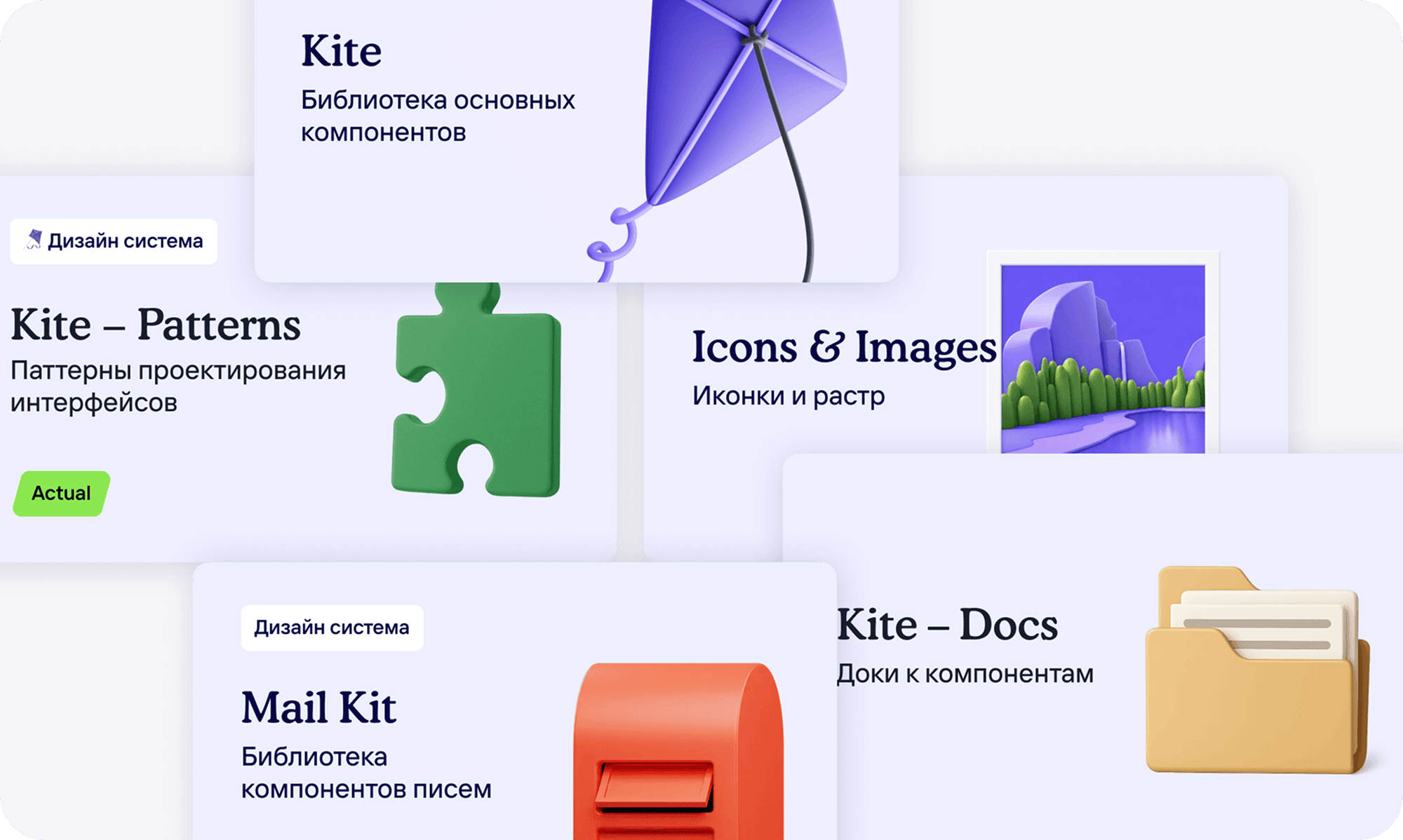
Of course, there is a component file. Besides that:
- Docs — detailed documentation with layouts and component behavior
- Patterns — flow and logic chunks aligned with product teams
- Icons & images — icons and visual assets (for example logos and country flags)
- Mail kit — a reduced component kit for email, still based on the same design tokens.
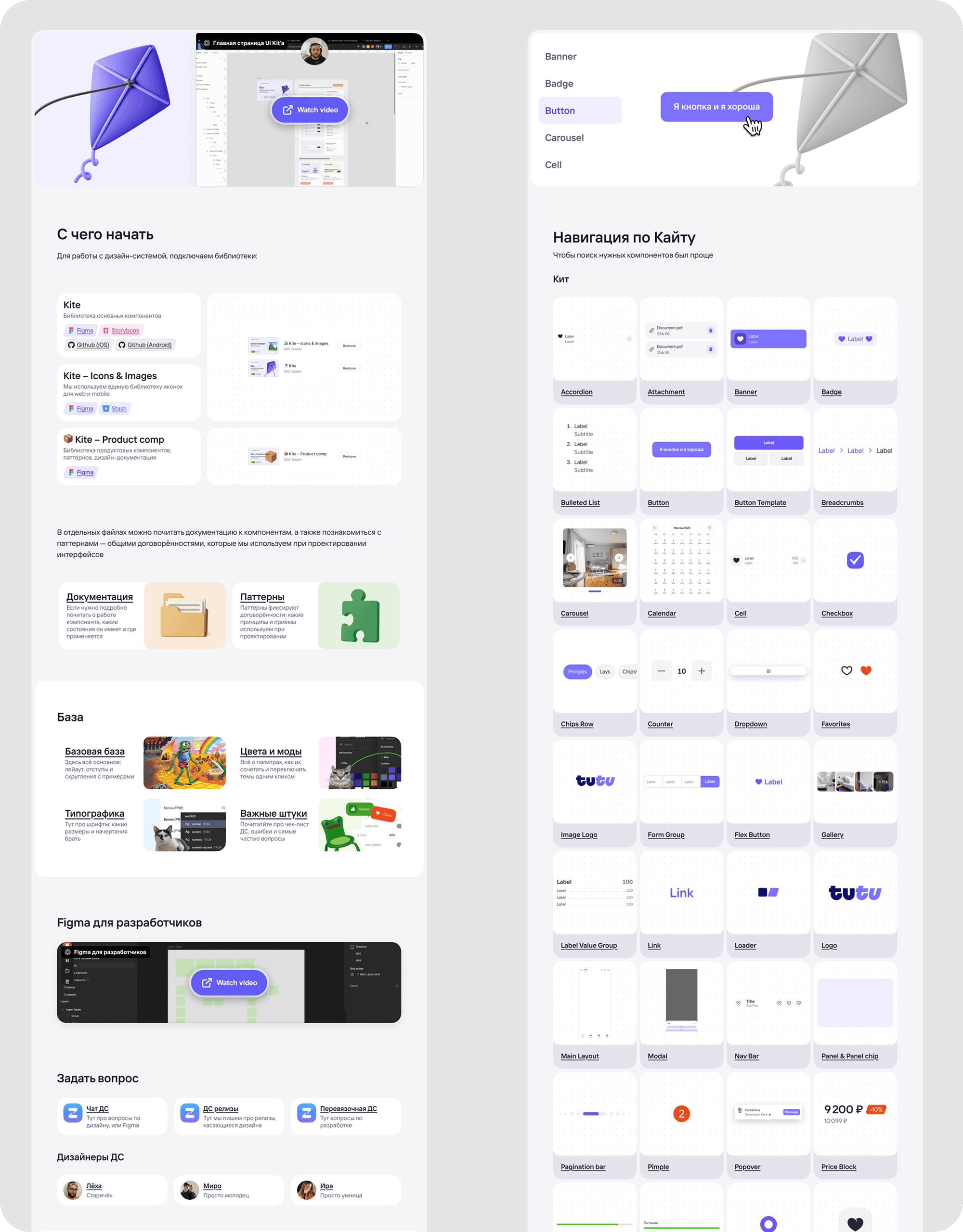
Where to start?
A classic pattern in my projects.This page contains key links and product information: who owns design, component coverage, what libraries are needed, and where they are located.It also has a component showcase, so if a user does not know a component name, they can find it visually and jump to the right page.
Design tokens
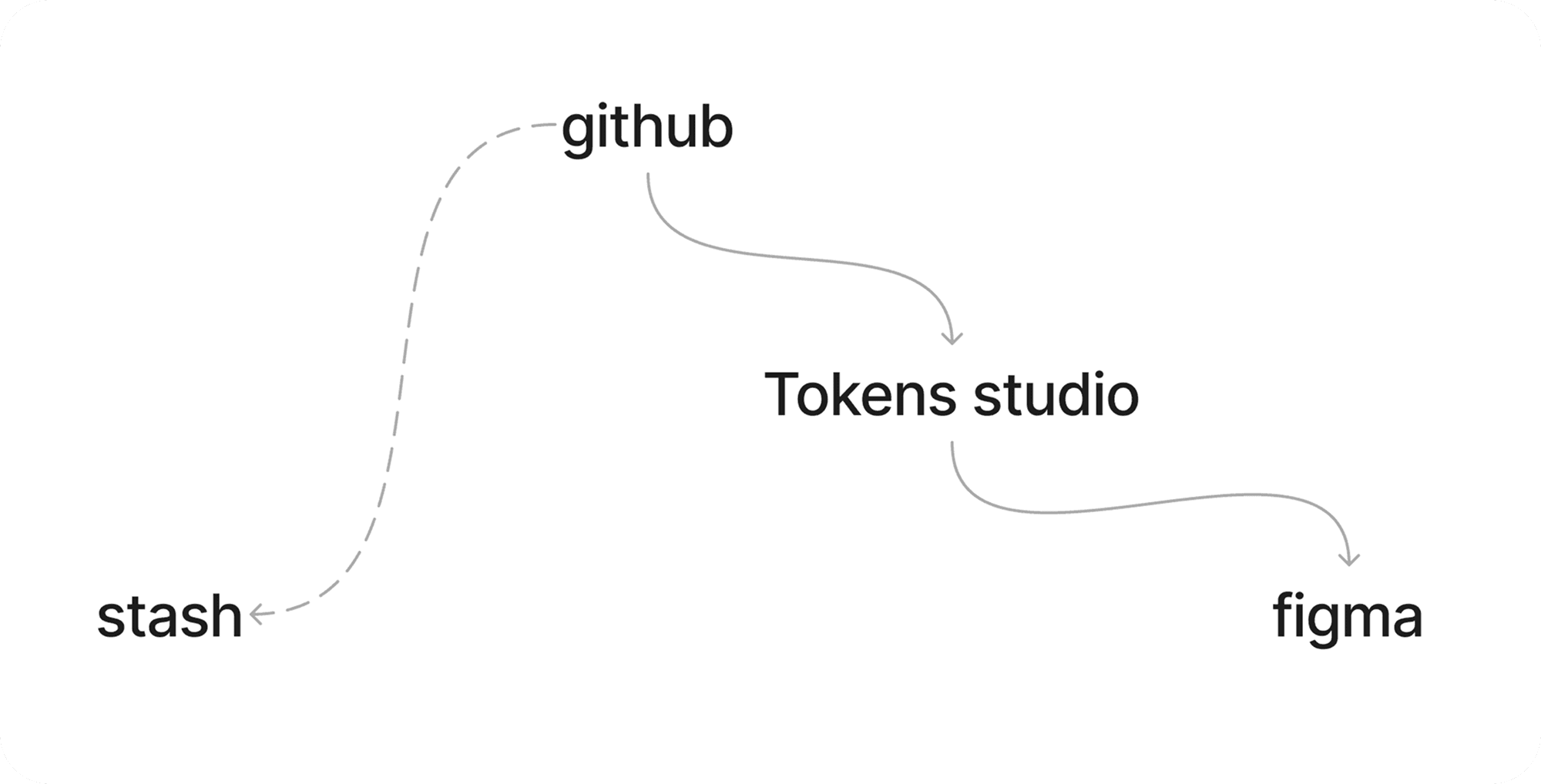
Design tokens as a JSON file on GitHub were delivered via Tokens Studio into Figma.Into the component library in Stash, we delivered them manually at that time because Tokens Studio did not support that flow yet (it does now).For iOS and Android, token delivery was automated.
The automated token delivery process saved us a lot of time. As you can see, there were many design tokens.
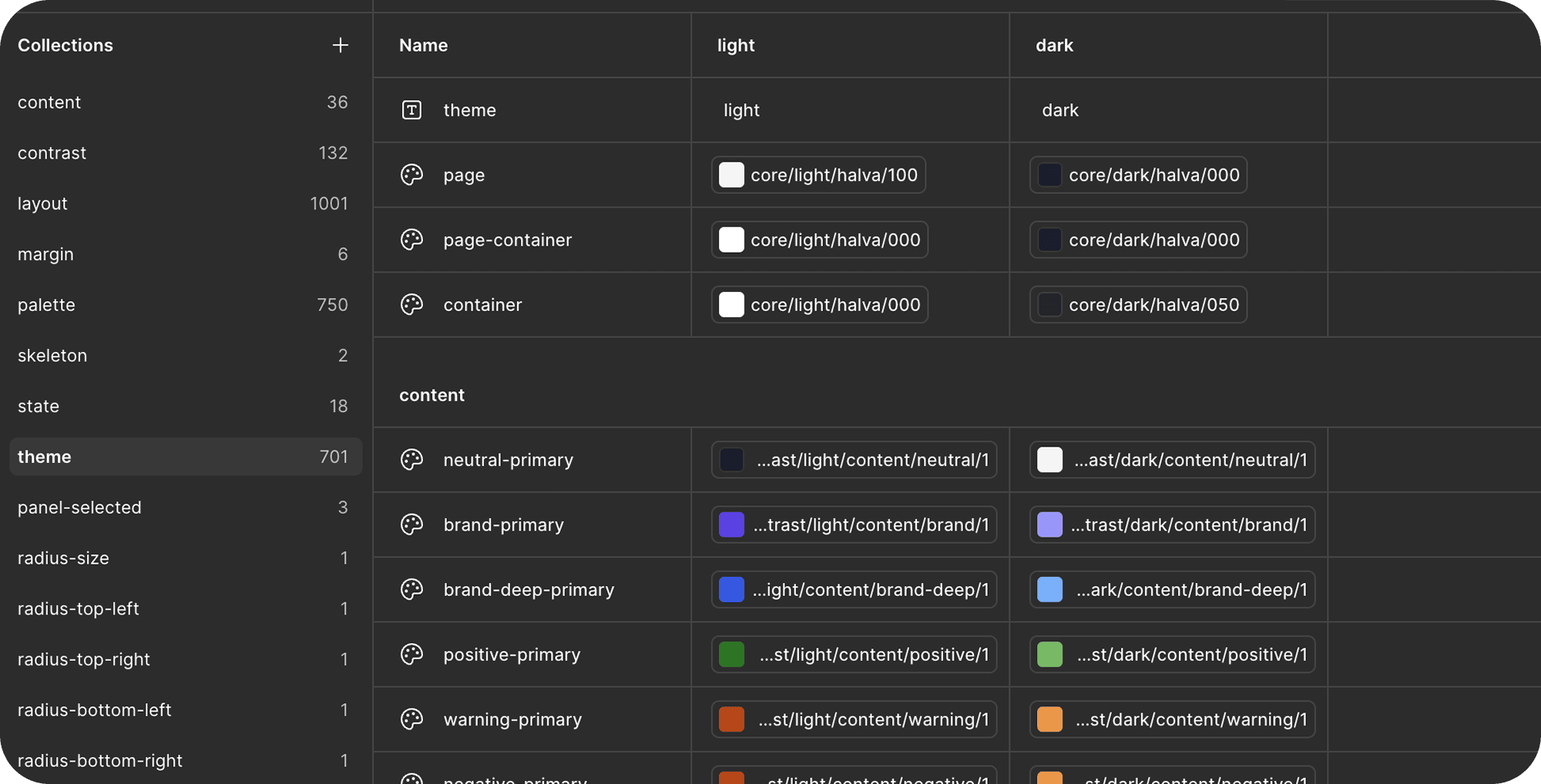
For colors, we used a rather complex dependency model for semantic and component tokens.Managing this manually would be unrealistic.
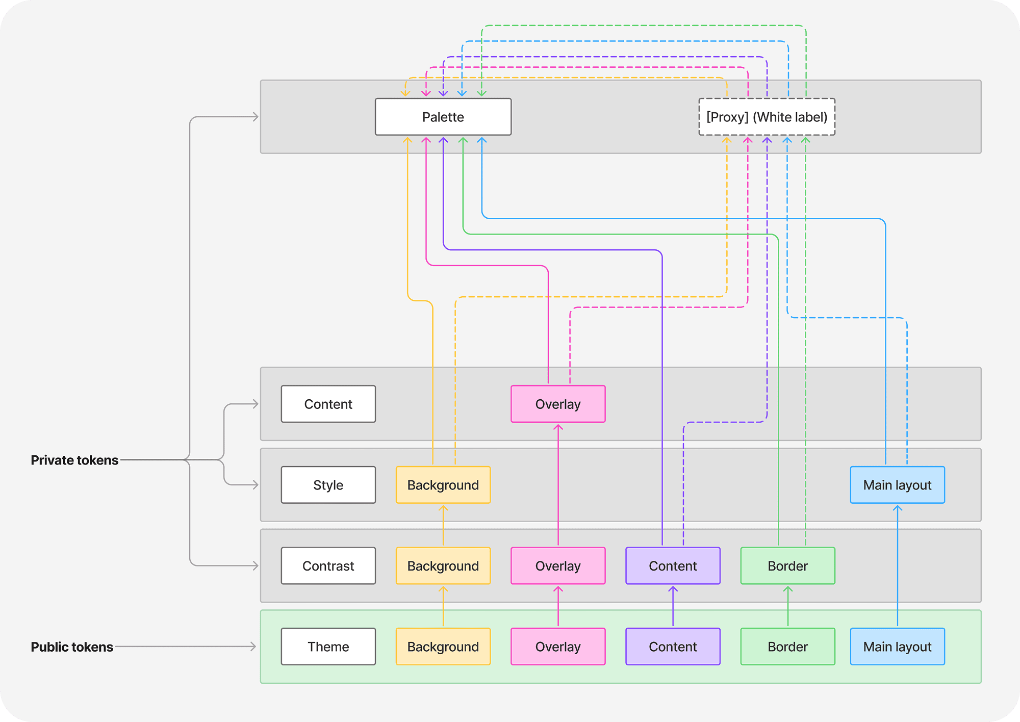
All these tokens are needed for mode support.For example: switching brand and light/dark theme.
Or switching element contrast.
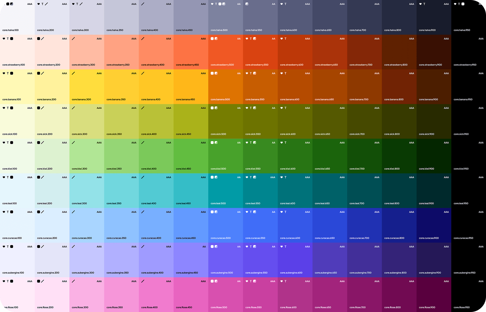
Of course, there are primitives as well, and we always know which primitives our semantic tokens reference (marked with icons).In our setup, light and dark themes are defined at the primitive level, so to avoid manually picking a dark-theme color every time, we assign a light-theme color when creating a component and get a valid dark-theme variant automatically.
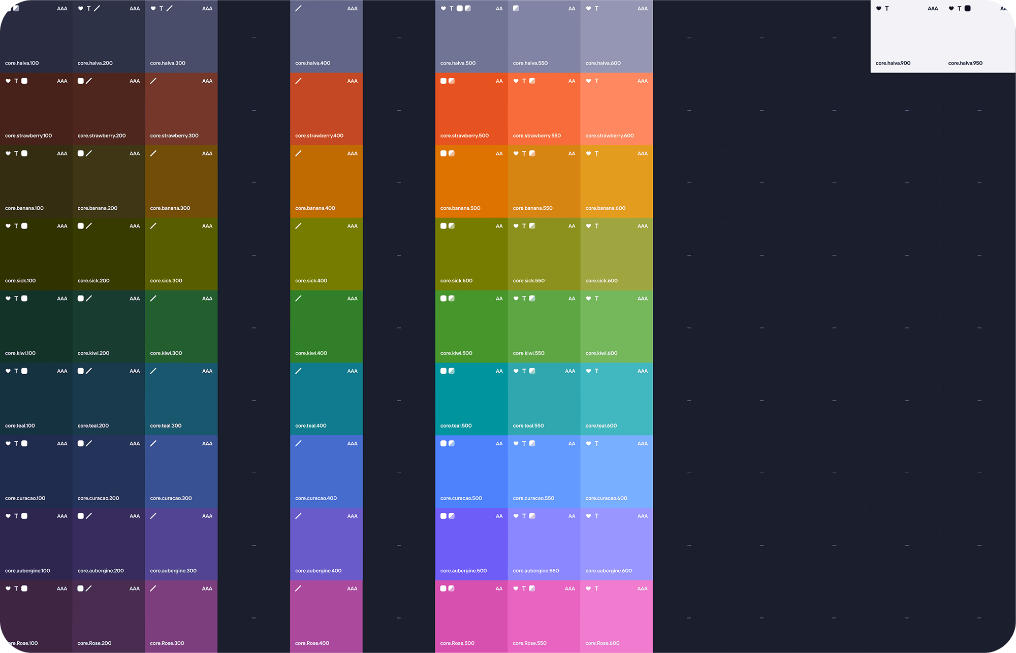
For the dark theme, only the colors that are actually used were computed, to save time.
Processes
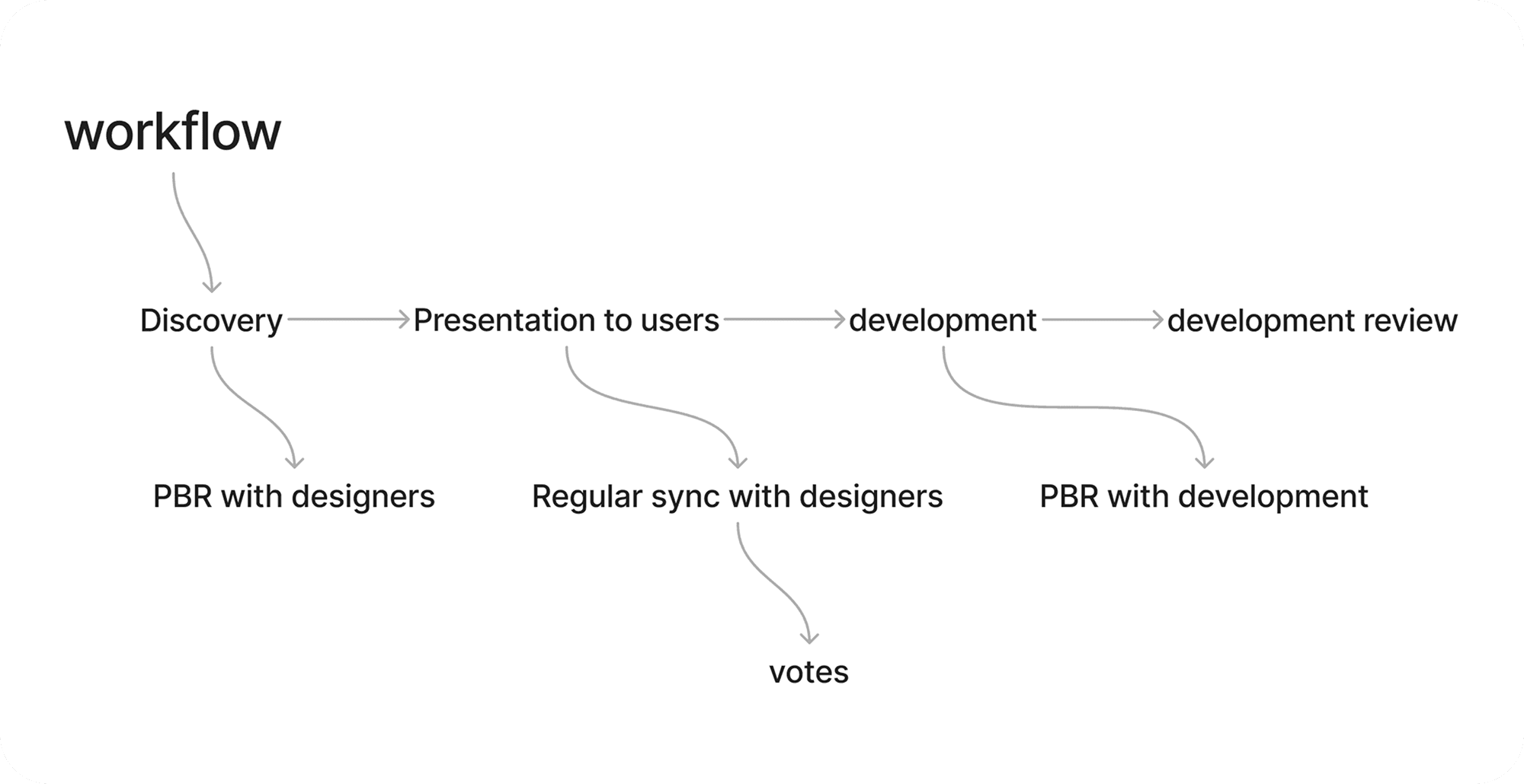
A design system is not only components and tokens, but also processes, people, and agreements.At Tutu, there were around 30 designers and x2-x3 developers, and at different stages we had to align with everyone - and often sell the design system through convenience, without administrative pressure.For every solution, we had a discovery stage: we discussed results with other DS designers, then presented to product designers, sold the solution, put it to a vote when there were multiple options, showed it to engineering, and reviewed the implementation result.
Components
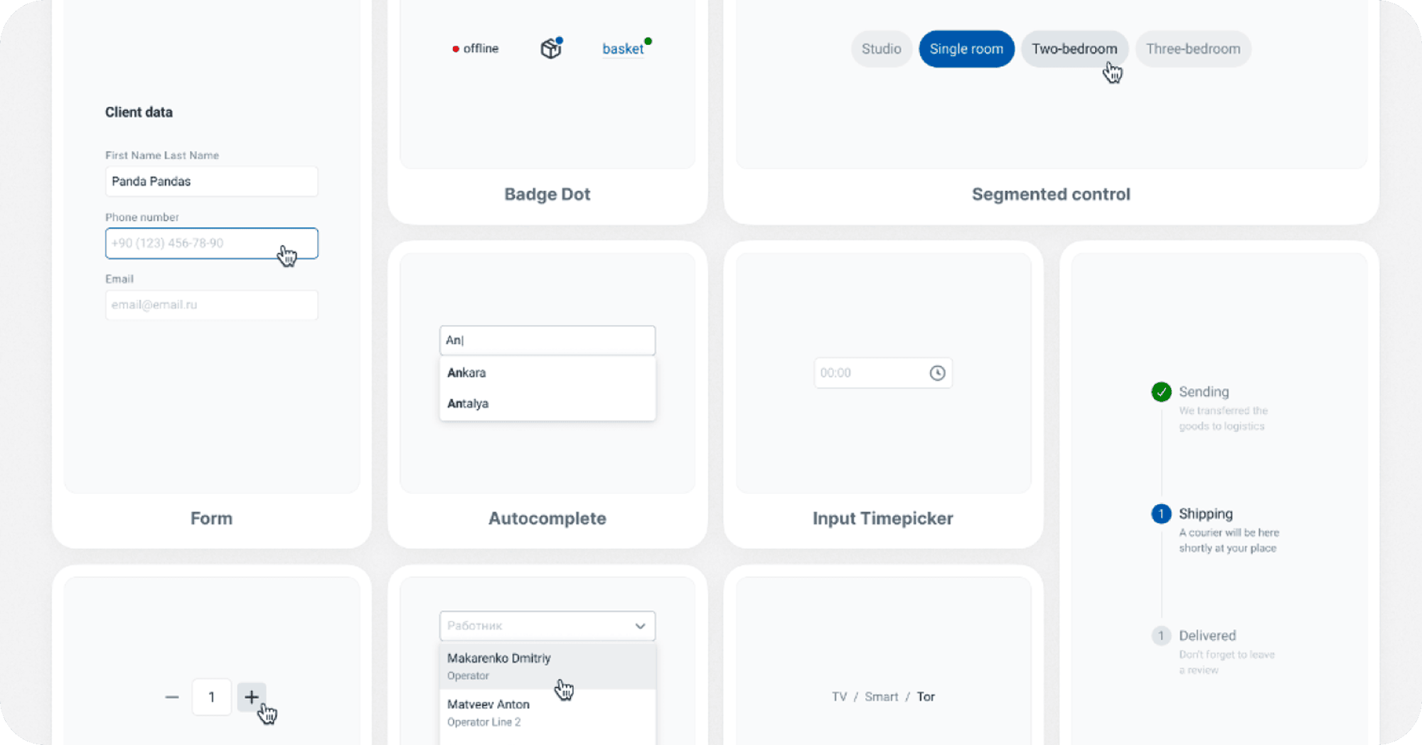
Kite is more than 60 components and a modes system that allows switching theme, brand, contrast, and adaptive behavior.